Shakespeare Adaptations
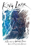
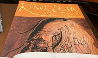
King Lear (2007-2009)
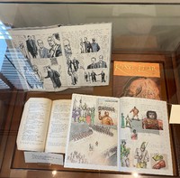
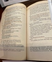
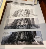
After adapting Beowulf and finding that there was an educational market for classic adaptations, Hinds decided to take on the challenge of adapting Shakespeare to the medium of comics. King Lear was Hinds’ favorite Shakespeare play, and he was keen to explore the ways the storm could be presented visually and used as a metaphor for Lear’s emotions and madness. This was his least planned and structured project, skipping the script and rough layout stages. Hinds made text edits in his battered copy of the play and drew the art directly into notebooks. The result was bursting the creativity, but also suffered from more inconsistencies and page layout problems than his other books. Hinds self-published King Lear and it was later reissued by Candlewick Press. The art is mixed media, primarily ink and watercolor.
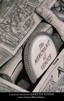
The Merchant of Venice (2008)
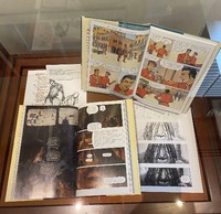
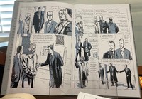
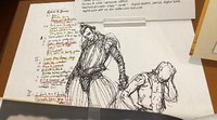
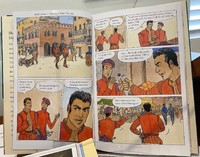
After King Lear, Hinds wanted to adapt one of Shakespeare’s comedies, and he chose the complex dark comedy The Merchant of Venice. After considering various approaches, he decided to set the play in modern-day Venice, and draw as much as possible from life – the settings and characters are all real places and people, with the exception of the more fantastical Island of Belmont. Hinds posed friends and acquaintances for the drawings, which are done in ink and white chalk with digital shading.
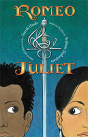
Romeo & Juliet (2013)
After The Odyssey, Hinds decided to return to Shakespeare and adapt the most popular of the bard’s plays (originally called The Most Excellent and Lamentable Tragedy of Romeo & Juliet). Hinds kept the play in historical Verona, but updated it with a multicultural cast of characters. The older characters wear period garb, while the younger characters wear short dresses and walk around shirtless to show their rebellion against the social mores of their parents. The art was drawn digitally, printed on watercolor paper and painted with watercolor and acrylic.
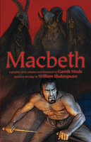
Macbeth (2015)
Hinds was excited to illustrate another personal favorite, “the Scottish Play,” with its dark, supernatural imagery, battles, and assassinations. Candlewick Press was so pleased with the art that they asked Hinds to adapt more horror, which led to the Edgar Allan Poe collection. The art for Macbeth was drawn in pencil, scanned into the computer and colored digitally, incorporating ink and watercolor textures.
In adapting these plays Hinds realized that the graphic novel format is an ideal way to experience Shakespeare’s work. Shakespeare meant for his plays to be performed, not simply read as a play. And yet, part of the reason his work has risen to the top of the literary canon is because when you read it you see the astonishing extent of the bard’s genius with words, verse, character, and imagery. The graphic novel format allows the reader to both see the “performance” and to read and savor the language at their own pace.
To view any of the exhibit objects in more detail, click on the thumbnail below.
